Update (2022/03/14): Due to Microsoft’s anti-competitive practices, I can no longer recommend Windows 11 for use. For the average computer user, there is not many alternatives right now so I will continue to support customers who install and use it. You can read more about my stance in my transition to the Linux Operating System for my own use.
Even though I think Windows 11 has potential in future releases, I strongly recommend NOT INSTALLING it until mid-2023 as it has major stability issues that can cause productivity concerns with your device. Better yet, sign up for my System Care Package, where I perform the upgrade, and work out any issues in a controlled environment.
What happened to the release of Windows 11? For those of you who follow Microsoft’s Windows evolution, this feels like a Windows Me1 release all over again. But just the way it was released and the bugs that prevented it from working correctly out-of-the-box. Windows 11 got a major facelift that was a long time coming and once the bugs are worked out, I think it’s going to improve your workflow.
You see, the problem started with Windows 8. Microsoft released the Metro User Desktop Experience(MUDE)2, remember that full-screen start menu that nobody wanted to touch with a ten-foot pole? Yeah, that was Windows 8, a disaster waiting to happen, and for the number of times I downgraded Windows 8 to 7, it was. It was Microsoft’s first attempt at entering the mobile market with Windows. With an “Almost There” approach, it attempts to combine mobile elements with the desktop look of Windows.
Microsoft improved the Metro User Desktop Experience in Windows 10. I mean, the full-screen start menu went dark, but the simplistic tablet design of Metro lived on in the Windows 10 Settings Menu3. Still a half-approach, but getting better as time went on.
Finally matured in 11. Microsoft took all the best elements of MUDE and combined them into your favorite desktop experience. It’s the little details that make all the difference, details that you will probably never notice. Real innovation works like that. Well-designed User Desktop Experience’s are so seamless to your everyday use, if you do look back, you will wonder how you ever lived without it.
The Good
The Start Menu
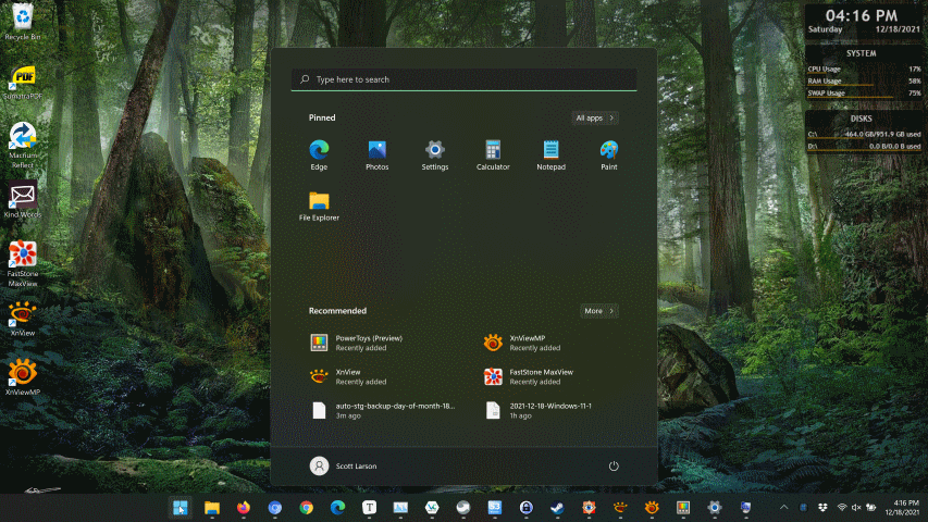
The new start menu reminds me of what you would see on a web browser home page like Mozilla Firefox or Google Chrome. It’s similar to the Windows 10 Start Menu, but the placement of elements is what makes all the difference. It’s way more intuitive than its predecessor, as the things that matter are all combined in areas of the pop-up window that makes logical sense.
It looks like Microsoft took inspiration from a utility called Powertoys. It’s a tool that incorporates features that stream-lines basic tasks like batch renaming files or resizing images4. But PowerToys also has this tool called Powertoys Run which feels very similar to the Windows 11 Start Menu.
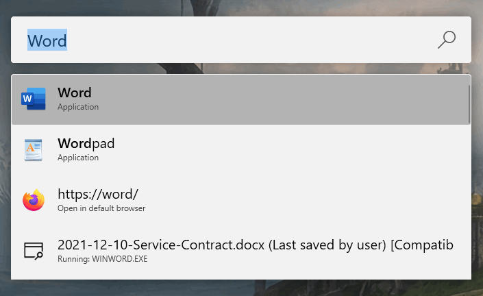
But Microsoft borrowed other features from Powertoys that makes using Windows 11 very cool but will get to that later.
The Settings
For now, I want to focus on the Windows Settings Menu which is supposed to be a replacement for the Windows Control Panel5. Remember I said that Microsoft didn’t quite let Windows 8 die? Right well, Microsoft brought some features from that failure to Windows 10. Thus was born the Settings Menu. From my standpoint, it was an annoying feature because it duplicated what was in the Control Panel. I mean, why reinvent the wheel? If it ain’t broke, don’t fix it. Well, I’m eating my words now because they fixed it. It’s a significant improvement from the Windows 10 Settings Menu.
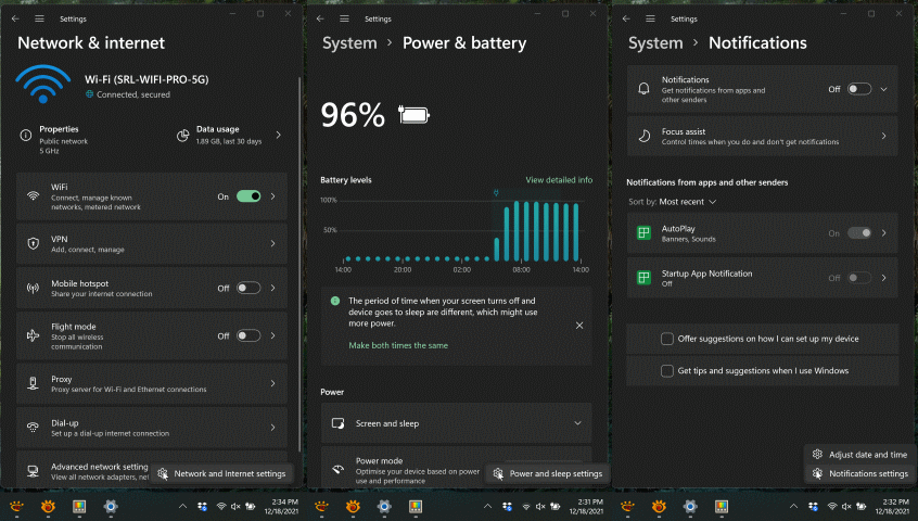
So what they did is combine the settings that are similar into menus and made these menus accessible from areas in the system tray6. Where the options should belong in the first place.
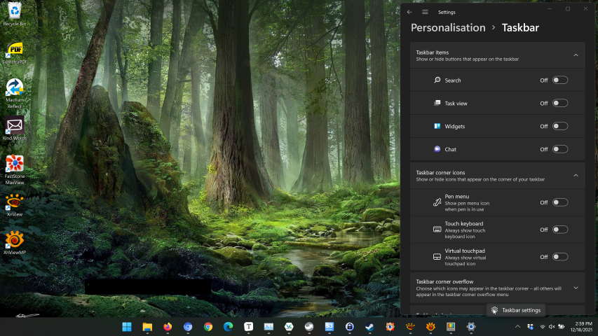
If you right-click on the taskbar6, the date/time, the speaker, or the internet icon, you are presented with a unified look that is very simple to look at and know what the options do.
SnapGrids & SnapGroups
The other cool feature I like, because I am a power user and I need my windows arranged in a very concise and organized way is the windows Snap Grids feature.

If you hover your mouse pointer over the Minimize/Maximize option of any window, a Snap Grid pops up giving you some choice on how you want those windows to be laid out on your desktop. These grids are called Snap Groups and can be accessed at any time from the context menu when you hover your mouse pointer over the corresponding application in the Taskbar.

If you look at these three pop-up tiles, you will notice that the third window to the right has windows arranged in a Snap Group. If you click on that tile, your Snap Group gets restored. This makes it easy to switch between applications with the Snap Groups saved between each application.
Not all is well with this release though, improvements are needed, at least, in my book. Since I am a power user, my criticisms below might be biased.
The Bad
Widgets
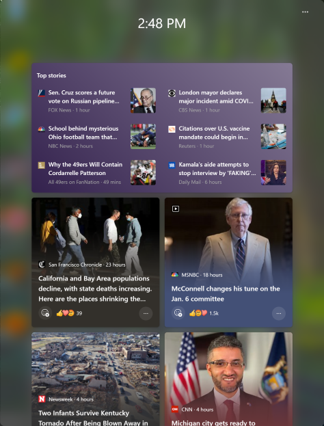
Ugh!! Ok, I didn’t like News & Interests Widget7 all that much when Microsoft included that little panel on the taskbar in a recent release of Windows 10, but the Windows 11 iteration is worse than I ever imagined. You still can’t customize this window with your own news channels. Who gets their news from Bing anyway?!?! I’ll have to say that it’s improving, and Microsoft is soliciting feedback right from the Widget so I hope to see some more customization options that are not coming from Microsoft-approved sites.
Chat
Microsoft includes their not so famous Chat tool, “Microsoft Teams”, into Windows 11. Once again, I’d rather use my own tools for this purpose, but at least you can turn it off from the taskbar settings.
Signing Into Windows
Windows 11 now requires creating and signing in with a Microsoft Account8. This is good from a security perspective if you are used to using 2 Factor Authentication9, bad for quick setup and customization, especially for technical guys like me who set up their customer’s devices for them. I’ll now need to interface with customers to create or set up login details every time I set up a new device. It slows down my setup services but it’s not a show stopper. Also, some people don’t really need an online account to sign into their devices.
The Ugly
Premature Release
Windows 11 early launch has some real issues that actually break currently installed apps. I had to roll a customer’s computer back to Windows 10 recently due to issues Windows 11 was causing with currently installed applications.
Driver Issues
There are also driver issues that can cause hardware to suddenly stop working, which requires the problematic option of rolling back a driver, which doesn’t always stick due to Microsoft’s auto-update service.
Gamer Performance Issues
It has also been reported that there are some performance issues with gaming that I have not been able to confirm.
The Context Menu
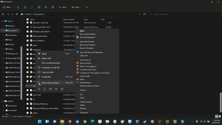
Right-clicking on a file or folder has a simpler list of options, which is nice for a basic user, but the advanced options are hidden away in a secondary advanced options menu. Imagine having to toggle a separate menu each time you have to do a simple operation of opening a file in a different application? Good luck with that Microsoft. I’m sure there will be a workaround for this soon.
Default Apps Settings
The biggest headache so far, at least for me, and I’m sure my customers are not going to like it as well, is the default settings for opening applications. In Windows 10, there was an easy way to change the defaults for your groups of file types related to things like your mail and applications, but now there is this convoluted settings panel that forces you to choose an app for every file type, making it very difficult, especially for average users, to change the way files open. Due to the way in which this tool was changed, I think it was a deliberate attempt by Microsoft to keep people on the Edge browser, and other default apps included with Windows to boost their own stats on how many people use their applications. It’s really a shame, and it makes be think twice about recommending Windows 11 to anyone, but hay, Windows 10 support ends in 2025 so you won’t have much of a choice anyway.
This hurts developers like Mozilla. Consider supporting the end of creative monopolies as they oppress developers and undermine social justice. I am very wary of any company that attempts to lock their uses into software ecosystems. Obviously, there are limitations to switching completely away from Windows, but I work to free myself from these limitations where I can. This is the main reason why I am switching away from Adobe products and working on open-source solutions. In my view, coming from 20+ years in the technology industry, individual choice is vitally important to the development of technology for an open and transparent society. When you limit your customers from making choices, you no longer deserve trust. Hence why an open-source developers often design software alternatives to break away from these limitations.
The Bottom Line
I’d wait to purchase any new device with Windows, at least until the middle of 2022. If you do purchase a new device, check to see if there is a Windows 10 option before purchasing. If you are thinking of upgrading, my recommendation is to wait until the bugs have been worked out.
For now, Windows 11 is one step in the right direction, but a giant tumble in the other, with its unpolished and unfinished current state. That might change soon though. I’m really looking forward to the restoral of the default app options that Microsoft has removed to make my job of servicing you easier and less costly.
Let me know what you think about these new features yourself, or if you have any questions about your needs!
Pros and Cons
Pros
- Clean and simplified new user desktop experience
- Excellent new productivity options like Snap Layouts and Snap Groups
Cons
- Premature release causing issues for many businesses and users
- The Widgets news feed is limited and only includes Microsoft’s services
- The new Default Apps interface is anti-competitive
- Windows 11 requires a Microsoft account and the device needs to be online to set it up
- The taskbar needs work as you are unable to change many of its options
Terms
- Windows Millennium Edition, or Windows Me is an operating system developed by Microsoft as part of its Windows 9x family of Microsoft Windows operating systems. It is the successor to Windows 98, and was released to manufacturing on June 19, 2000, and then to retail on September 14, 2000. It was Microsoft’s main operating system for home users until the introduction of its successor Windows XP in 2001.[6] Windows Me is viewed as one of the worst operating systems Microsoft has ever produced, being unfavorably compared to its immediate predecessor and successor.[64] Due to its many bugs and glitches, Windows Me is considered one of the worst operating systems of all time. A PC World article dubbed Windows Me the “Mistake Edition” and placed it 4th in their “Worst Tech Products of All Time” feature in 2006. ^
- A term I created to outline the Metro User Desktop Experience. The Metro UI (User Interface) was first developed with the release of Windows 8. It included features to simplify the user experience: Larger Icons, Removing extraneous information and streamlining the look and feel of the UI to appeal to casual users. This first iteration implemented in Windows 8 was a disaster because Windows has always been a desktop computing experience and many people preferred the original UI design. Eventually, Microsoft improved its design in Windows 10 and now in Windows 11, it has matured. ^
- Microsoft developed a new UI(User Interface) in Windows 10 that was based on the Metro User Desktop Experience from Windows 8. The Windows 10 Settings User Interface was similar to The Windows 8 experience but it was improved to be more user friendly. ^
- A tool or method of applying a particular setting that you want to be applied across a group of files ^
- The Control Panel is a component of Microsoft Windows that provides the ability to view and change system settings. See the Wikipedia article for more information. ^
- A taskbar is an element of a graphical user interface which has various purposes. It typically shows which programs are currently running along with a system tray along the right of the taskbar that has the date & time with the controls for sound and networking. It also contains the options for apps running in the background. ^
- A Widget is a little application that allows you to customize it to display personalized information or perform some action. ^
- A Microsoft Account is a single sign-on user account for Microsoft customers to sign into online services related to Microsoft’s products. With the introduction of Windows 10 and 11, Microsoft introduced signing into your computer using a Microsoft Account. This makes it easier to change your password and you can sync custom settings and features between multiple devices. Microsoft has been pushing this feature aggressively in Windows 10, and now with it being required to set up Windows 11 it feels forced. Data collection concerns are a real problem for many people and this way of signing circumvents that. ^
- An a secondary authentication method used in conjunction with a sign-on password which aims to prevent access by an unauthorized third party that may have been able to discover the account password. ^
